Here is a quick template I put together using Paint.net because as well as making a poster and a trailer, the criteria I have been given includes a magazine cover, poster and a film trailer. The image of the main cover star at the moment I want to be half of the girl in the attics face and half of the main woman's face to show how the girl has taken over her. The main house colours will be probably black red and white as they represent Horror and Gothic.
Thursday, 31 October 2013
Wednesday, 30 October 2013
Poster Ideas (Drafting and Planning)

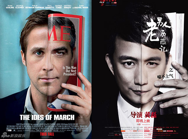
I love the use of two different faces on this poster and feel they almost both reflect a good and evil side. I may use this idea on my poster as the use of the cover star are the main focal point of the poster. If they were to be stuck on a bus stop I feel they would really drawn in attention as they are excellently positioned on the page. The symmetry on both faces make you double take as at fist it almost looks like one face and then you realize it is actually too.
Poster ideas (Drafting and Planning)
This film poster for dead silence is what I have based my idea on, however although my poster will be slightly different in that it will have half an evil face and half a good face. I really like the positioning of the face on the page and the use of the dolls finger almost indicating a sense of secrecy and fear of the unknown... I will include this in my poster. I like the idea of using half a face as there is an air of mystery that surrounds it.
I also like the idea of having a long shot with one main image that entices the audience. The whole poster is then focused on that on image, so it needs to be domineering and a striking image that will evoke the feelings of terror and horror within anyone who views it.
'The Unborn' is an example of this, the long shot shows a generic horror convention, something appearing in the mirror behind the character, the long shot is able to portray this and therefore the genre is evident.
Monday, 28 October 2013
Poster Analysis (Homework)
Here I have analysed the poster for Sin City, I looked at font, language, lighting, positioning, actress, colours and captions, all which make up the poster, I looked at why they were used and the effect on the poster.
As you can see from the image I have included all different aspects of media language, and described how they are effective within the poster.

Similarly, again using the different aspects of media language, I have annotated this film poster of 'Casino Royale' and described the ways in which media language is effective.
Sunday, 27 October 2013
Shot List (Organisation/Drafting and Planning)
Again this may change depending on the filming of my trailer, but I am going to try and stick to these camera shots.
Shot list
Establishing Shot - Car driving into the drive
Mid Angle Shot - Couple looking up at their new home
Low Angle Shot - House
Low Angle Shot - Woman walking up attic steps
Establishing Shot - The attic scene
Long Shot - Woman sorting through boxes, girl in the mirror behind her
Long Shot - Woman looks in the mirror, girl has disappeared
Long Shot - Woman looks in the mirror, girl has disappeared
Subscribe to:
Posts (Atom)


